"Aarhus Raadhus" – a typeface and a city hall
Our way of saying thank you to our city
“You take out the garbage.” “Why”? “Because you’re born into this family that loves you, and which gives you what you need. It is in your interest to take responsibility for this family to function and thrive. The same goes for our community, village, town, nation, and even the whole world”.
2K/DENMARK was founded in 1987 in the great city of Aarhus. When, in 2012, we were planning to celebrate the 25th anniversary, we felt the need to thank our city and looked for a way to do so.

A hand painted projecting sign in the walkway (Eng. “Budget and planning”)
INSPIRATIONAL OLD SIGNAGE
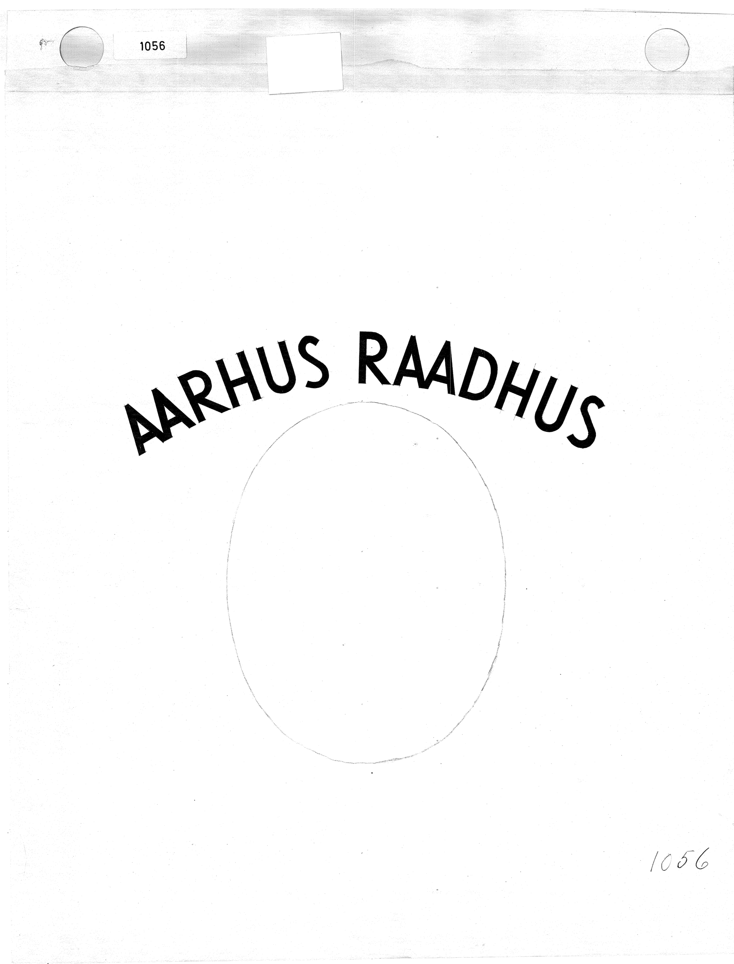
A symbol of our unique city is its city hall, and I remembered once having seen the instruction sheets created by the architectural firm to help and inspire the sign painters when they did the original signs as the building was being furnished. However, these sketches were never turned into a typographical font. As time passed by, when new signs were needed or replacement of old signs was required, other typefaces that did not match the beautiful house were randomly chosen.
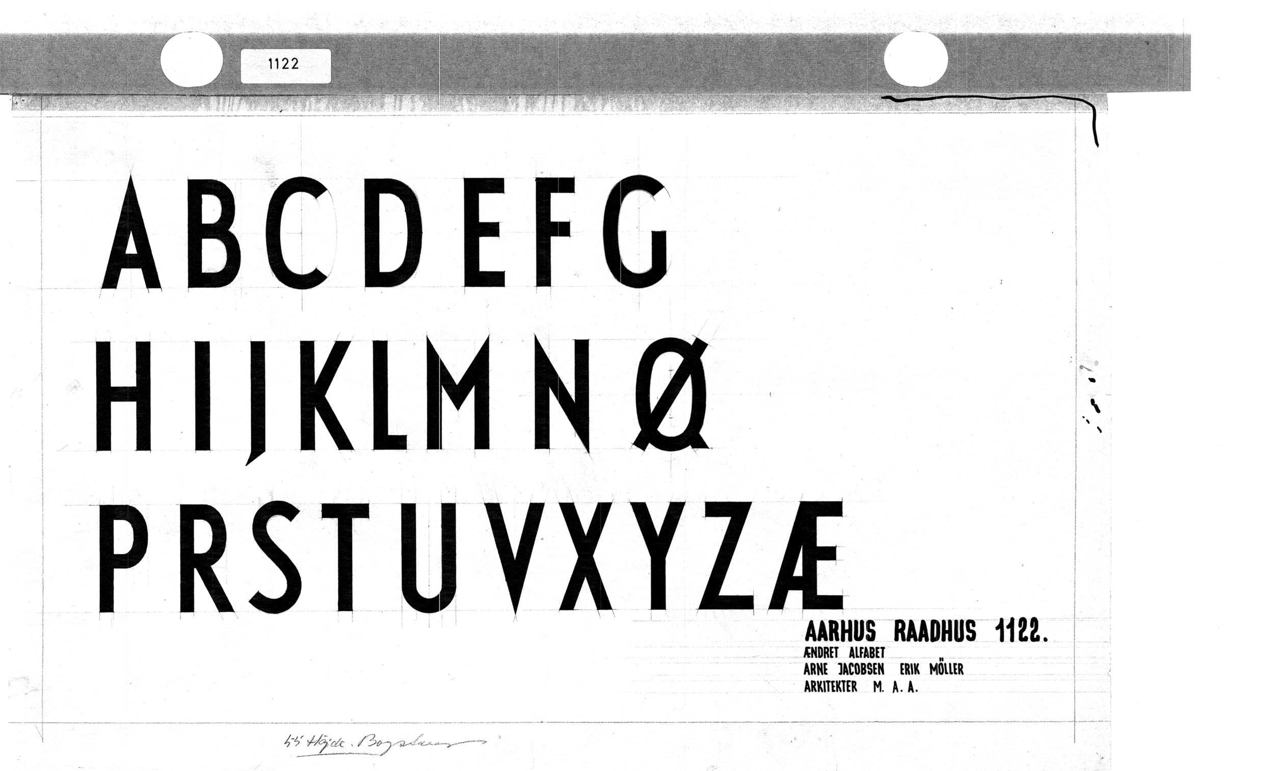
Considering the skills and experience represented at 2K, we had found the gift: the design of a new Open Type font, inspired from the original instruction sheets, to bring back the typographical quality in the city hall signage, that had been the ambitions of the architects.
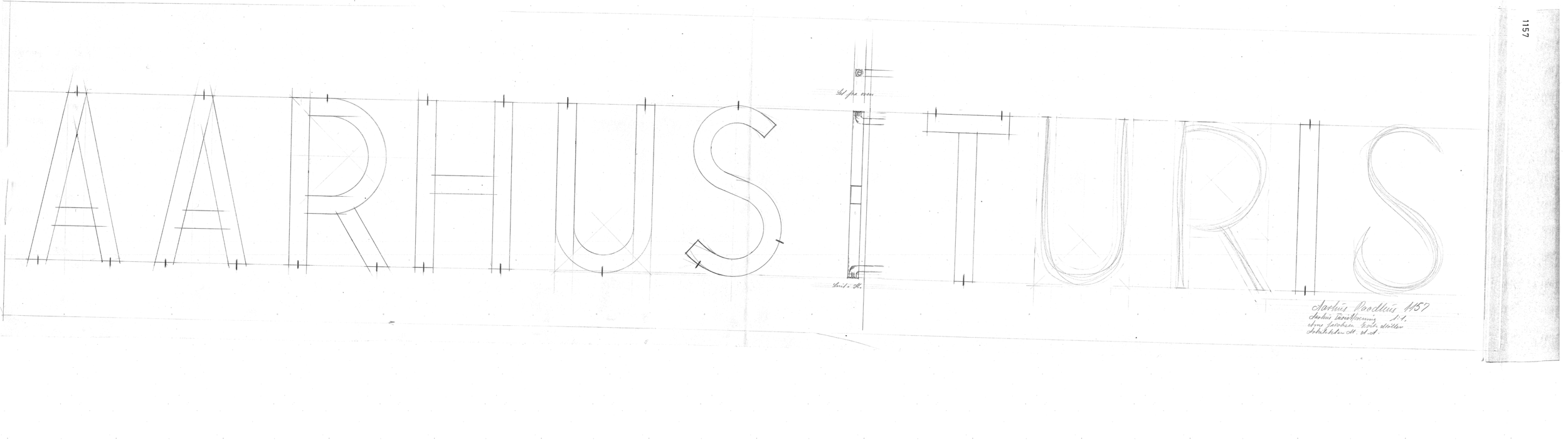
Original sketches clearly showing the geometric approach to the construction of the letterforms
Another source of inspiration came from looking at the surviving original signs. The skilled sign painters made the many hundreds of signs as freehand lettering, and it is a joy to discover the individual interpretations each craftsperson had drawn from architectural sketches.
In our research, we looked at the typefaces from the functionalist period that must have inspired the work at the architectural studio: Geometric sans serif faces like Paul Renner’s Futura released by Bauer Type Foundry, 1927, Rudolf Koch’s Kabel released by Klingspor Foundry, 1927 and William Addison Dwiggins’s Metro released by the American Mergenthaler Linotype Company, 1929. Metro was, in its first version No.1, a lot less geometric than the abovementioned, but the demand for strict geometric typefaces made it less popular, so in the Metro No.2 released in 1932, the inspiration from the highly geometric Futura was more pronounced.
Although the architectural ideas present in Aarhus City Hall where stylistically cutting edge in 1942, the inspiration for the typeface was a decade old, as the release years above show. That is quite a lot in the most artistically innovative century, but the combination seems in perfect balance.

A NEW OLD TYPEFACE
From these three inspirational sources, 2K created the font Aarhus Raadhus. To celebrate that the City Council had taken the wise decision to revert the name of our city from the “Århus” (using the Danish special letter Å introduced in 1948) to “Aarhus”, we included an AA ligature as a specific feature.
Aarhus Raadhus font is presently used by the city hall administrations every time new signs are needed, e.g., in the assembly hall after general elections where new members need new signs.
Did 2K “take out the garbage” by designing the Aarhus Raadhus font and presenting it as a present for the city hall?
I hope that we helped preserve an original ambition, for all users of this iconic work of architecture to enjoy.
