The Potency of Typography
Well-chosen words deserve well-chosen letters
Typography makes up so much of the reading experience and communication process that it is a fundamental raw material, which the typographer can control. Should authors experience some uneasiness in placing such an integral part of their work in the hands of a typographer?
HOW DOES THE TYPOGRAPHER GO ABOUT HONESTY?
Honesty is a virtue of the typographer, and is essential in communicating the author’s intended meaning, the “text as pure word”. That is, the authentic and reliable presentation of meaning by the most potent means of communication, the typographic book.
Doing so will produce good typography and reliable interpretation. And honest work produces a unique beauty and clarity of its own.
It requires a carefully calculated and executed subordination to the textual content and author’s intent. The first step towards this is simple, that is to read and understand what is to be communicated. Although seemingly straightforward, it is remarkable how uncommon this is; there are few typographers willing to put themselves in the position of the reader.

THE AUTHORITY OF THE BIBLE
A purpose must be defined, the force behind the typographic book. In light of defining a purpose in the context of the Bible, it is difficult to establish a correct interpretation. This is a vexing task in itself, made all the harder by the 66 books of varying genres, written across time and by different hands. This isn’t a discussion on the correct interpretation of the Bible, rather the authentic presentation of the text, where the typography is in line with the authority of the author. Here that authority is the word of the author itself, the Word of God.
Irrespective of a ubiquitous authority, however, the Biblical texts are written and structured purposefully to communicate something definite to the reader, and this intentionality extends to the form. The typographer’s duty is to communicate this intention, the inner logic of the text shaping the outer logic of the typography. Although perhaps not immediately apparent to the reader, this inner logic can be seen to varying extents through careful study (for example academic methods such as discourse analysis, or more accessible techniques such as “arcing”). Understanding this will help the typographer shape the fundamental material into something that will communicate the text in agreement with its authority. Similarly, typographic formatting more in line with cognitive processes takes into account how meaning is constructed, and therefore how interpretations are formed. This allows the intended message to be more accurately and reliably reconciled with the received effect. You do not have to be a psychologist to be a typographer, but you do need an awareness of typography as a thing to be read and understood, not just looked at.
Likewise, you do not need to be a theologian to be a typographer. The typographer does not have to interpret every last detail (an impossible task) on behalf of the reader, as long as it does not hinder. Honouring the text means being transparent and not imposing your own will upon it, and this humility – the ability to direct all attention away from the medium and towards meaning – is more valuable than academic or theological understanding.
(It is most apt to look at typography in the context of The Bible, The Book of Books, remembering that “One could walk the history of printing on the spines of great Bibles” [Barry Moser]. It also brings two elements to the fore, beauty and interpretation. These aspects should be present in any discussion about typography, but nowhere so exigent as here. No other book can ask such questions of interpretation and truth, or has had such beauty imposed upon and attributed to it.)

FORM AND THE CONSUMMATE PARTS
In the case of the Bible, that the communication process be reliable is of the utmost importance. As Stanley Morison said, “God forbid, the printer is to come between the reader and his chosen author”. Their job, typography, is the distribution and control of space and type, the shaping of the page. The type is to the typographic book as the bricks are to a building. The gestalt cannot be built with anything else, but more important than the individual elements is the way they work together to make the whole, the laying of the bricks, the form of the page. Details in the form of the page all influence legibility. This extends to every intricacy of the design of the typographic book, the page size, the titles, the margins and countless other jobs that fall under the typographer’s watch.
If untamed, every aspect of the typographic book will attempt to overthrow the one thing in which they share common purpose, the unhindered transfer of information by means of the book as a whole. If the typographer succeeds in this restraint, allowing everything to be beautiful in its own right whilst serving its purpose to the fullest and nothing beyond – even going so far as to restrain beauty if his duty requires it – then we have a book with good and pure typography, a pure mode of communication of ideas from one mind to another. Cobden Sanderson coined this consummate whole the “Book Beautiful”.
And, “a truly beautiful book cannot be a novelty. It must settle for mere perfection instead”. The typography that settles for mere perfection is invisible; it effaces itself to serve something that it simultaneously desires to destroy. “Vulgar ostentation is twice as easy as discipline” [Beatrice Warde].
Beautiful typography that is not legible fails at its primary function, that is, to communicate. Legible typography that fails at beauty is no typography at all, at least not good typography. Typography that is made only to serve beauty draws too much attention to itself and becomes an inadequate vehicle of communication. The reader’s eye must fall upon the page, be pleased, and know where to go. The page must be distinctively appreciated, not for the signifier but the signified.
CONTEXT MATTERS
However, there is no singular or definite typographic solution, as is the case with all texts but chiefly the Biblical text. There will always be a range of solutions, each effective in its own right. But the art of good typography lies in the appearance that it could simply appear no other way, that it is the only natural typographic expression of the text. It is not a straightforward art; the same text can appear separately in different forms, essentially altering what is communicated to the reader (and therefore their interpretation).
Another element to be considered is the audience and their expectations, with which the typography must be harmonious. If the typographer fails here, the typographic book can be confusing and self contradicting, if it even manages to make it off the shelf. There may be a “correct” typeface or format for a specific job, though this could not be said for a specific text. The Bible is the best example of this; indeed it would be impossible to define the ideal presentation for every physical or digital iteration of the Biblical text. Different presentations and formats are prerequisites of different audiences and purposes, for example study, personal devotion, or public performance.
No other text has had so many faces; the timeless nature of the text itself is contrasted by its ever changing appearance.
The longer the book, and the longer you want it to last, the less rules you can break. The typography must be set not only on what grounds are most suited to the text itself, but also on the grounds of financial limitations. No other book has been at once printed most extravagantly and most cheaply. Many formats will be simply inappropriate on practical grounds, even if their character is in keeping with the text.
And on top of this, several genres make up the Bible, yet the vast majority of Bibles present them consistently. However, it could be dangerous not to, as the potential for a lack of harmony would impair good typography. Contextually sensitive formatting is one of the key practices to the production of good typography, but certain boundaries must be raised in order to conserve harmony.
GENRE MODELS
A genre model – being contextually sensitive to the genre and context of the text – would suggest the presentation of texts should reflect their intention, this presentation defined by cultural consensus and expectations (tradition). This, however, must not be taken out of context. A letter of Paul’s should not be presented in the typical contemporary format of a letter, even though it would quickly and effectively communicate to the reader what they were reading, and to an extent its context. The same can be said if it were to follow the original presentation, a stream of capitals in Greek with no punctuation or spacing.
Robert Waller’s genre model, for example, would hope that a typographic appropriateness to texts would “help readers navigate complex content in a way that suits their particular purpose”. This however, does not mean blindly formatting sections of Biblical text deemed to be poetic into a generic poetic format. This may signal that the text is in fact poetry, but if not set in a contextually sensitive manner, it loses the intended semantic potential of poetry through faux formatting. Ultimately, decisions must be lead based on textual content, not design aesthetics.
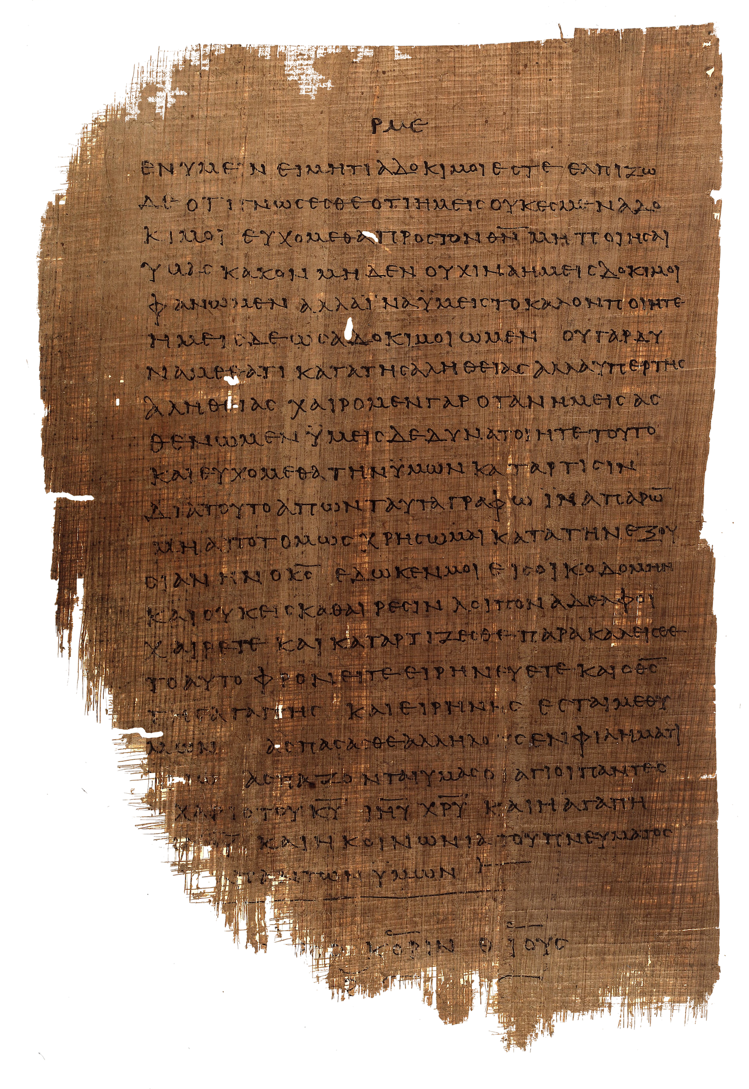
A folio from Papyrus 46, containing 2 Corinthians 13:5-13. Papyrus 46 is one of the oldest known Greek New Testament manuscripts probably written between 175 and 225.

CONCLUSION
The Bible is a complex typographic problem to which there are no easy or universal solutions. The typographic problem of the Bible is just that, a problem of typography as opposed to a problem of theology. But to treat it as such negates the potential theological impacts of the decisions of the typographer.
The goal is communication, and typography is on the front line. It is what ultimately has the final say in the perception of text, i.e. the reader’s interpretation of the Bible. A reliable communication process can be threatened by the typographer. The translation of the text into a visual medium should not be taken lightly. It has the potential to be abused or misused, intentionally or not. But it also has the potential to be used to benefit the reader in a clear and lucid communication of the text. Transparency and humility are virtues of good typography, and these virtues result in beauty, as Beatrice Warde said; “You will be able to capture beauty as the wise men capture happiness, by aiming at something else”.
There must always be caution in approaching presentations of the Biblical text. The typographer’s role is one of both interpretation and communication, and typography is too potent a medium to blindly assume fidelity in the transfer of meaning. As Robert Bringhurst notes, “the meanings of a text (or its absence of meaning) can be clarified, honoured and shared, or knowingly disguised” through the use of typography. The faithful presentation of the Bible should be an imperative.
WELL-CHOSEN WORDS DESERVE WELL-CHOSEN LETTERS; THESE IN THEIR TURN DESERVE TO BE SET WITH AFFECTION, INTELLIGENCE, KNOWLEDGE AND SKILL. TYPOGRAPHY IS A LINK, AND IT OUGHT, AS A MATTER OF HONOUR, COURTESY AND PURE DELIGHT, TO BE AS STRONG AS THE OTHERS IN THE CHAIN.

Rory J. Snow
A freelance creative designer based in Hartlepool in the northeast of England. He has a special love for the Bible, whether reading it or talking about its typography. You can find his work at besnowed.uk.