The Transparent Design Model
From idea, through words, to visualisation
Earlier we brought the essay “The Crystal Goblet” written by the legendary typographer Beatrice Ward. She claims that graphic design work is successful if it ends up invisible. Or in her own modernist explanation: “The book typographer has the job of erecting a window between the reader inside the room and that landscape which is the author’s words. He may put up a stained-glass window of marvellous beauty, but a failure as a window; that is, he may use some rich, superb type like text gothic that is something to be looked at, not through. Or he may work in what I call transparent or invisible typography.”

SIMPLICITY VS. FUNCTIONALITY
Not disagreeing with Beatrice Ward completely when she argues: “that the most important thing about printing is that it conveys thought, ideas, images, from one mind to other minds,” I am sure that there is much more to designing the link between an author and her readers. And this “more” can exist without being “an expression of beauty for its own sake and for the delectation of the senses.”
Whereas the design and layout of a text-only novel might benefit from a modernistic, simplistic design, the more complex communicative interfaces of, e.g., a magazine or a study Bible, clearly represents problems not solved by mere simplicity. The way we at 2K try to meet these challenges is to see our relationship with the reader as if we had a contract, saying: “We, 2K, promise to deliver a typographic presentation, that clearly differentiates between different types of content, but also ensures that similar content will look and feel similar. We hereby provide you, the reader, upon entering the contract by recognising these different design patterns, with a navigation tool letting you know at any time what kind of content to expect and how it relates to other types of content.”
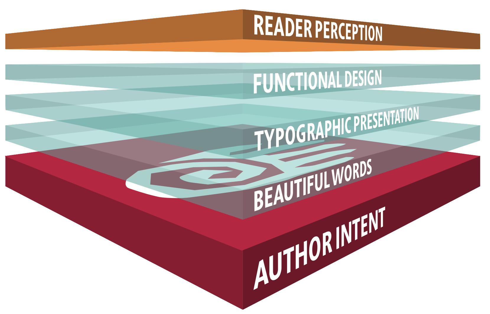
But what exactly are the promises we as designers have to deliver? What is our part of this deal? What kind of tools do we utilise in our quest, on one hand, to design distinct, aesthetic, and coherent communicative interfaces, while on the other hand, functionally differentiate between categories of content? To explain the different tools and how the reader might experience them (consciously or not) 2K came up with the Transparent Design Model.
A MODEL OF FOCAL LENSES
Just as Beatrice Ward uses the metaphor of the crystal goblet to describe the transparent or invisible typography, we use glass, but as translucent layers working as metaphorical lenses to focus and emphasise differences in content categories to make them stand out and be recognisable in the communication interface. Doing that, the goal of invisibility in the design evaporates, but from this loss, a more reader-friendly interface emerges.
The need for communicative interfaces arises from the need to express ourselves by telling a story, enlightening or even warning people! This foundational “author intent” is what drives editors, designers, typesetters, and printers/binders to do their very best to produce a product that is worthy of the content. The translucent layers of the Transparent Design Model describes the designer and typesetters efforts as they are experienced by the reader.

We all read like the Chinese, not just decoding one letter at the time, but most often do we recognise entire words and even clauses at a glance. Most people are capable of reading with the same pace as they talk, but we could not possibly do that if we were to look at each and every letter, then recognise the sound it denotes, and then put these sounds together into words. We recognise words. Beautiful words created from letters crafted with artistic skills and precision. This is the way the reader obtains the information embedded in the letterforms, and effortlessly recognises phonemes, words, half or even full lines. A well-designed typeface is foundational to an ideal reading experience.
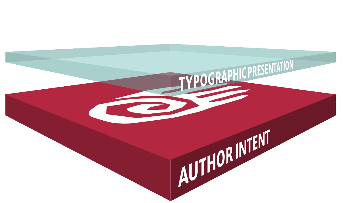
To successfully design the Typographic Presentation, you must be aware of a number of interdependent variables, the most basic of which are the type size, the line length, and the vertical spacing (leading). At a larger scale the designer has to administer the whitespace: the margins, the column widths and gutters. The whitespace is often defining all other choices in a book design. Together with the layout principles, all the above variables relate to the trim size (which is oftentimes predetermined) and to each other. Then the typesetter takes over the process of adjusting font size, the distance between letters (kerning), and the distance between words (spacing). All of these decisions are crucial to the page count, but most of all, the right decisions ensure a pleasant reading experience by eliminating bad line-, column-, and page-breaks.
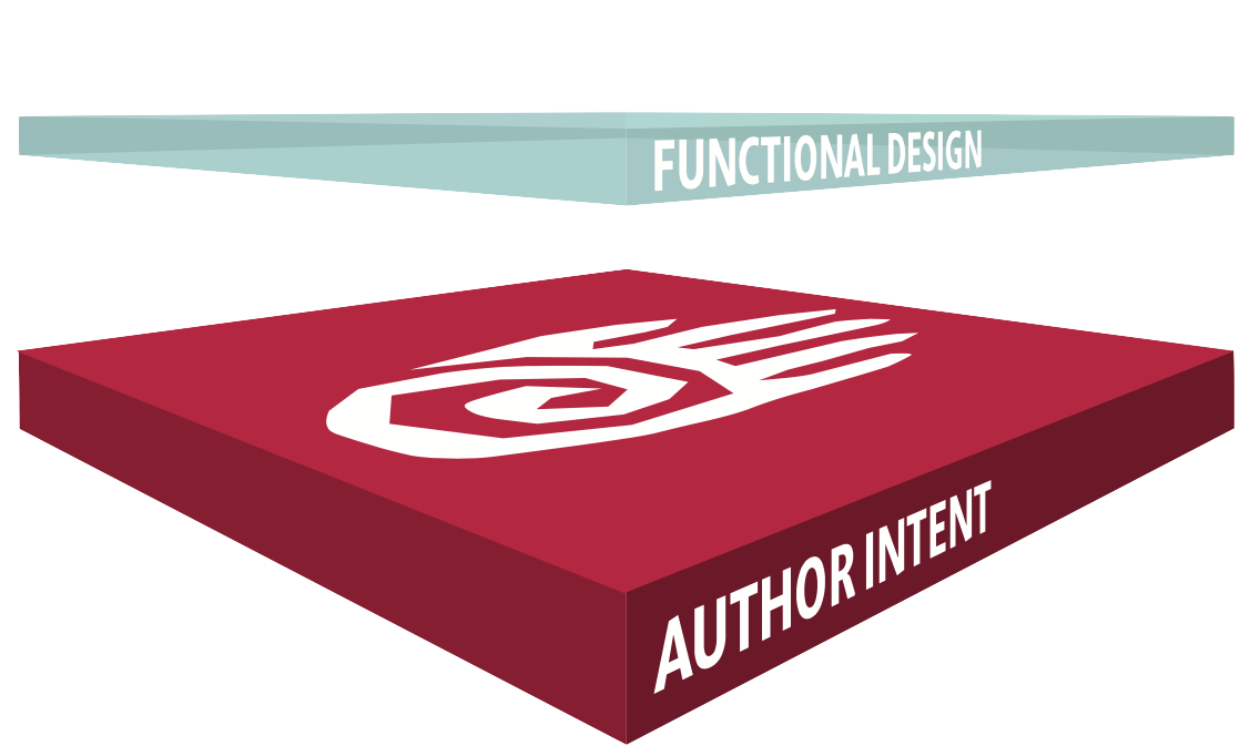
The more natural and effortless the reader is able to recognise the genre of the text, the better conditions they have for interpreting its meaning. This is the purpose of Functional Design: to use creative solutions within the palette of design and layout, to highlight the distinctive character of different types of content and in this way make reading more comfortable and at the same time create communication interfaces with greater individuality and variation.
So use a more interesting design, emphasising the individual needs of the text, by using the typographical toolbox, to create an interface attracting more readers. And in turn these readers will read longer because the Functional Design enhances the reading experience.
The better 2K is capable of adjusting all 3 focal lenses, the better the chance for a positive Reader Perception. We have only one ambition: To make the project we are currently working on successful, and if possible better than the previous!